 October 13, 2015
by Jennifer Lea Reynolds
The Coca-Cola logo is commonplace and well-established; the slanted white lettering on a red background is recognized by virtually everyone around the globe. However, a Nicaraguan graphic designer by the name of Fabio Pantoja is changing things up, and not in ways that would please the soda giant.
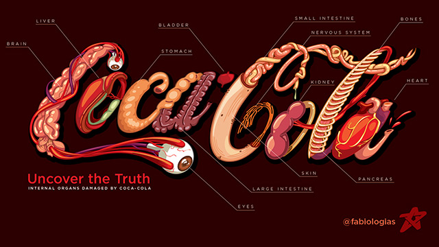
In an effort to visually convey the health harms that Coca-Cola unleashes on the body, he created an unexpected twist on the otherwise simple, lighthearted logo.
His shocking infographic incorporates the various body parts that the soda destroys right in with the lettering; for example, there is an eyeball dangling from either end of the “C” and a heart makes up the second “A.”
Learn more: http://www.naturalnews.com/051540_Coca-Cola_organ_damage_soda.html#ixzz3puY6X9lz
